Typography
Typography involves the style and appearance of written language. It plays a crucial role in enhancing readability, establishing hierarchy, and setting a visual tone, resulting in more effective and expressive communication.
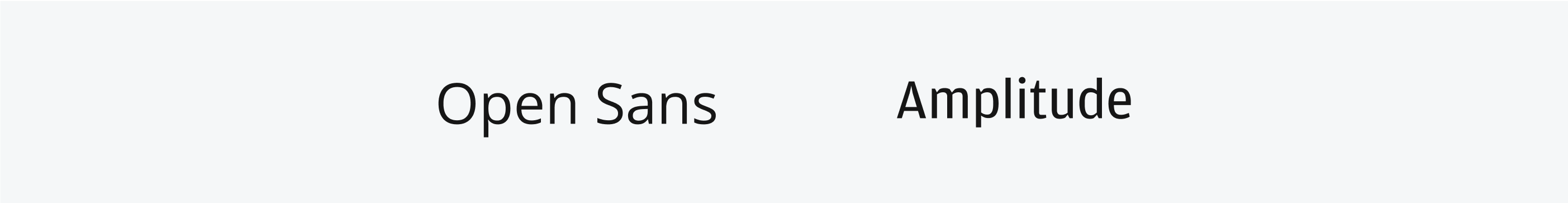
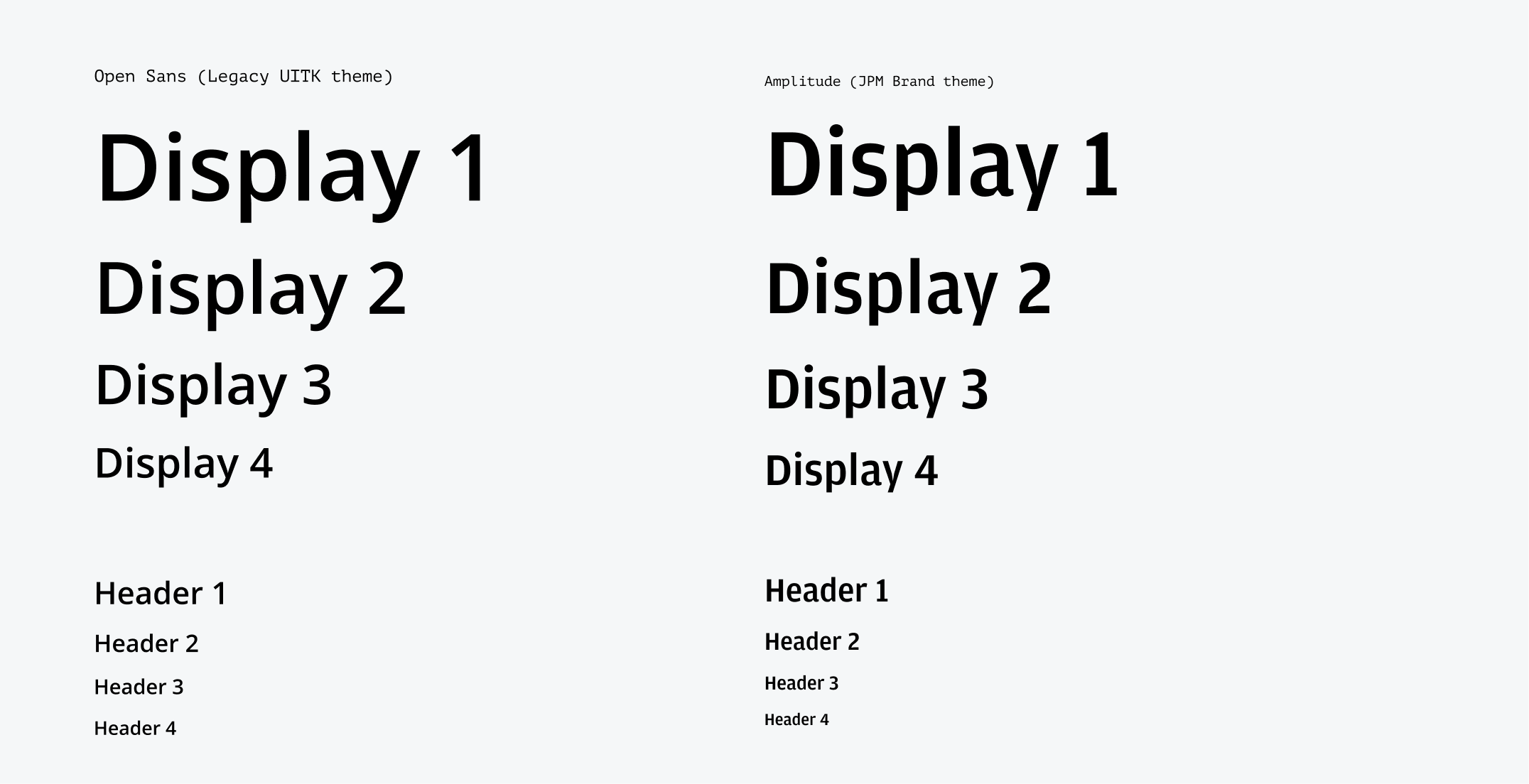
The Legacy UITK theme uses the open-source, sans-serif typeface Open Sans. The JPM brand theme uses the Amplitude font which is in line with updated brand guidelines. Code uses the mono space typeface PT Mono.
For more information about the themes offered in Salt, please refer to the guidance on the themes page.
To download the Amplitude font, please refer to the font brand resources on our internal site. (Internal users only)
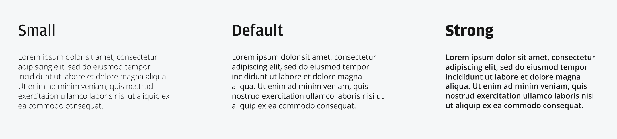
Weight refers to the relative thickness of a font’s stroke. Each type style includes three weights which enable you to create visual hierarchy within the same text size.
| Font weight | Purpose |
|---|---|
| Small | A thinner weight alternative to de-emphasize default weight |
| Default | The default weight across the system for visual balance |
| Strong | A stronger, bold weight alternative to emphasize default weight |
Type hierarchy arranges text elements by varying font sizes, weights, and styles. This guides the reader's attention and conveys content structure.
| Text style | Purpose |
|---|---|
| Display | Display styles are primarily for representing key metrics and mastheads |
| Headings | Headings separate sections of content into varying levels |
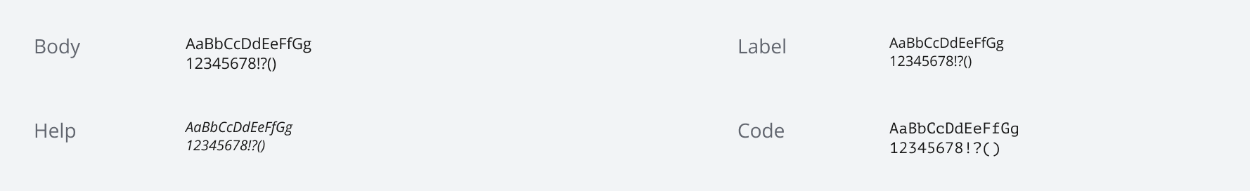
| Body | Body is the default style for most components and text blocks |
| Label | Labels display a small amount of text that helps people understand the current context of a component |
| Help | Help text provides additional information or instructions, such as accepted data formats for input or file types for upload |
Line height controls the space between baselines within a block of text and should be proportional to the text size, typically set at 1.3x the font size across all styles. Line height may also vary with text density.
There are three cases recommended within our content guidelines:
Sentence case is primarily used for body copy, page titles, navigation, subheadings, form titles, field labels, and chart/data visualization titles and text.
Title case should only be used for proper nouns and job titles. Proper nouns refer to specific individuals, companies, products, or objects.
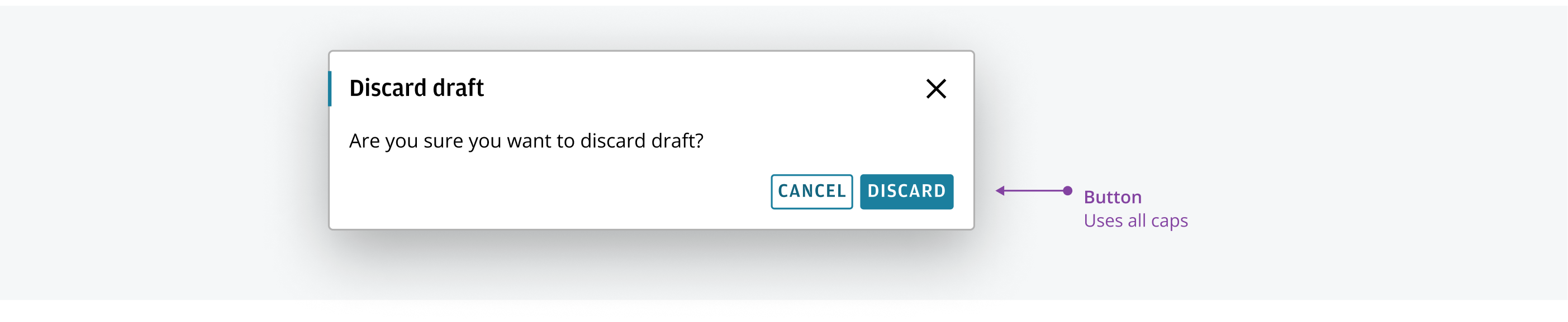
All capitals are used for button labels to give them prominence and to differentiate them from other graphical elements. Never use all caps in general writing.
Italics are applied sparingly to short pieces of text to help differentiate text. They serve to differentiate text from the surrounding content and should be used independent of changing font weight.
Full sentences or blocks of text are generally not italicized. Combining italics with font weight for emphasis is not recommended.

Notation is a text style characterized by its discrete font size, making it ideal for use in confined spaces such as the Avatar and Badge components. This style is also well-suited for footnotes and disclaimers, ensuring that important but less prominent information is clearly communicated without overwhelming the main content.

We appreciate your thoughts and feedback on any content in the Salt foundations. Please contact us if you have any comments or questions.